Plot Results
Interactive multi-parameter trade-off explorer, Pareto optimization, and candidate distribution tool for antibody screening.
This tool enables scientists to dynamically plot and evaluate any computed or experimental developability metrics against one another, identify property trade-offs, explore single-metric distributions, and visualize multi-dimensional candidate distributions without relying on external spreadsheet software.
Accessing the Tool
From the Project View, select one or more antibodies (or leave unselected to plot the full project). Go to the Analysis menu and select Plot Results. This will open the Plot Results workspace in a new tab.
Using the Tool
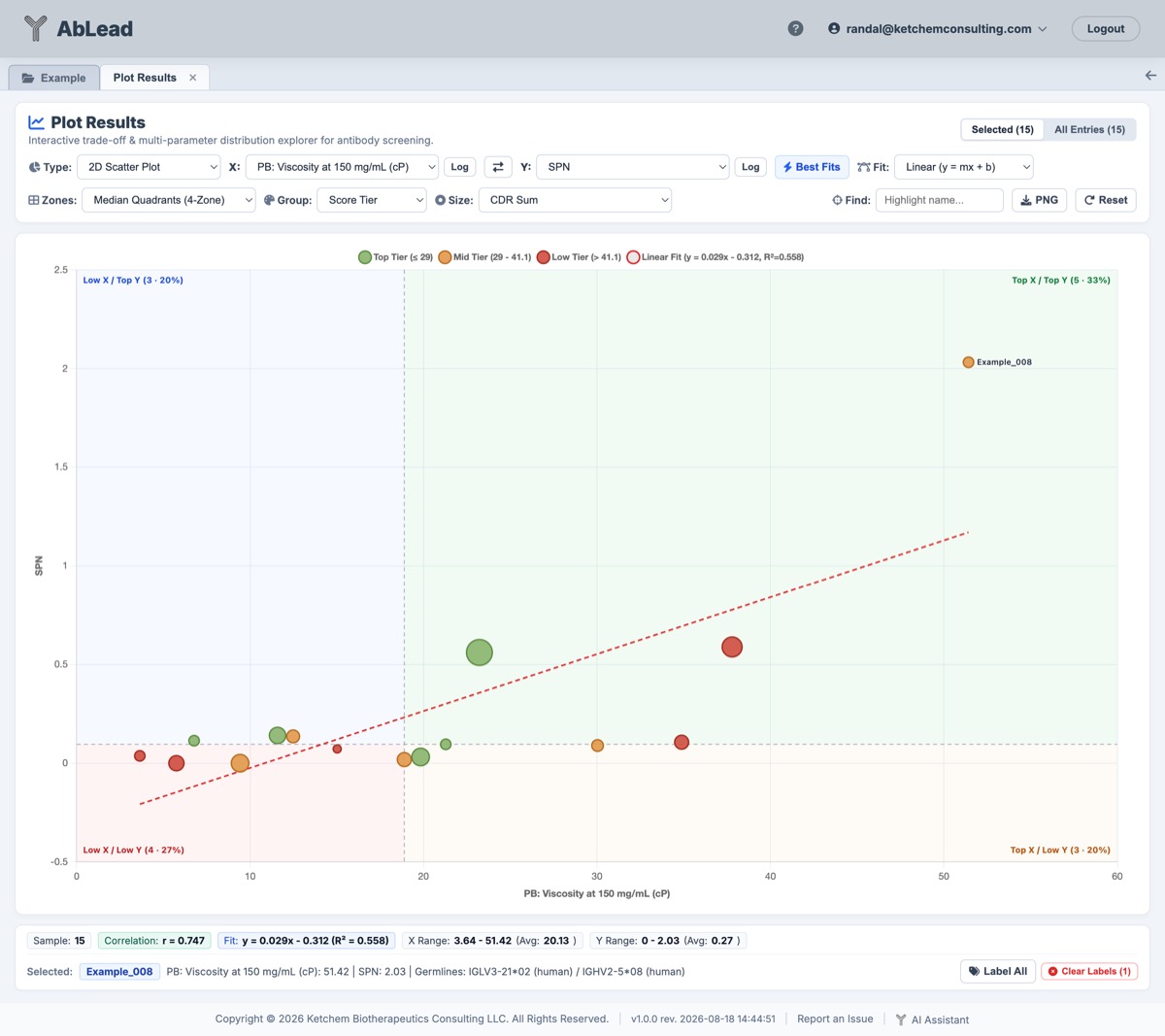
Plot Results offers an interactive Chart.js canvas with comprehensive controls to customize axes, regression models, categorical groupings, and bubble dimensions.
Chart Modes
- 2D Scatter Plot: Correlates any two numeric properties on customizable X and Y axes for visual Pareto optimization and trade-off screening.
- Box Plot: Compares property distributions across categorical groups (e.g. Parent Clone, Germlines, Species, Score Tiers) with overlaid interquartile range (\(Q_1\) to \(Q_3\)), median, mean, min/max whiskers, smooth kernel density violin contours, and jittered individual candidate data points.
- Distribution / Histogram: Bins candidate values into dynamic frequency histograms to assess population spread for any single metric.
- Bar Ranking: Displays a sorted, ranked bar chart of all candidates for quick comparative ranking. Candidates are automatically sorted from best-performing to worst-performing based on metric polarity (ascending order for developability liabilities, penalties, and KBC Scores where lower is better; descending order for humanness, percentage identity, and stability where higher is better).
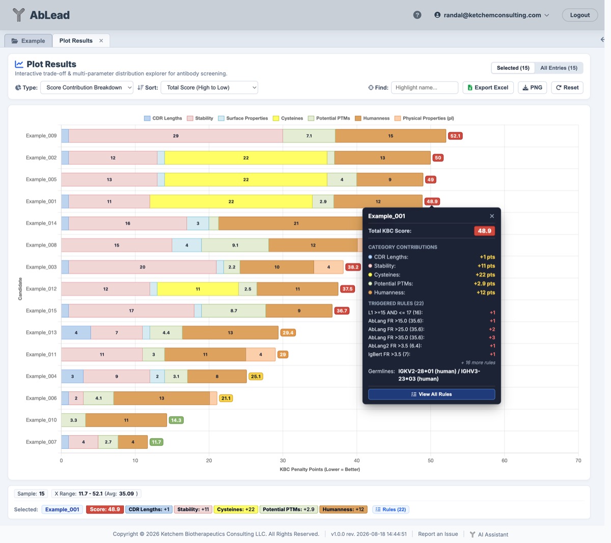
- Score Contribution Breakdown: Decomposes the composite KBC Score for each candidate into a horizontal stacked bar chart color-coded across all standard developability categories (CDR Lengths, Stability, Surface Properties, Cysteines, Potential PTMs, Humanness, Physical Properties, and User Motifs). Renders in-bar category penalty numbers, results-matched severity badges, an itemized rules modal, and downloadable styled Excel spreadsheets.
- Dimension Reduction (PCA / UMAP): Projects high-dimensional developability, stability, surface patch, humanness, and biophysical properties into an interactive 2D landscape. Supports deterministic Principal Component Analysis (PCA) with explained variance ratios, component dimension toggling (PC1 vs PC2, PC1 vs PC3, PC2 vs PC3), and publication-style biplot loading vectors, as well as non-linear Uniform Manifold Approximation and Projection (UMAP) for resolving non-linear candidate clusters.
Metric Selection & Axis Scaling
Metric menus for the X-Axis, Y-Axis, and Size strictly follow the left-to-right canonical column order of the results grid:
- Genetic Origin: V-Gene and J-Gene percent identity (%id) across Light and Heavy chains.
- Nearest Neighbor: Sequence distance to the nearest reference or parental sequence.
- CDR Lengths: Individual CDR lengths (L1–L3, H1–H3) and total CDR sum.
- Stability: AbLang2 and AbLang framework/full scores, severe framework violation counts, and disrupted salt bridges.
- Surface Properties: Spatial patch metrics (SPH, SPP, SPN, SPCD) and DeepSP surface descriptors.
- Predicted Biophysical Properties: All 10 developability and machine learning models prefixed with
PB:(e.g. PB: Hydrophobicity, PB: Colloidal Stability, PB: Self-Association, PB: Polyreactivity, PB: Cross-Interaction, PB: Thermostability, PB: Expression Titer, and PB: Viscosity at 150 mg/mL) to distinguish computational predictions from actual experimental metadata. Warning: Predictions for Expression Titer and Thermostability (Tm) have lower reliability and should be treated as informational only rather than definitive criteria. - Cysteines & Potential PTMs: Quantitative liability counts (unpaired/unusual cysteines, deamidation, isomerization, N-glycosylation, oxidation, hydrolysis, fragmentation).
- Humanness Score: OASign humanness metrics (VL, VH, and combined Fv).
- Physical Properties: Isoelectric point (pI Bjellqvist), net charges at pH 5.5, 6.0, and 7.4, and dipole moment.
- KBC Score: Overall composite ranking score. Can also be decomposed and itemized by category using the dedicated Score Contribution Breakdown plot mode.
- Metadata: User-uploaded experimental columns and custom metadata.
Axis Scaling & Numerical Formatting
- Logarithmic Scaling (
Log): Dedicated Log toggle buttons next to the X and Y metric dropdowns switch axes to a \(\log_{10}\) scale, rendering logarithmic decade ticks, adjusting quartile zone shading, and re-spacing histogram distributions into logarithmic bins. - Directional Axis Scale Titles: Scale titles dynamically append directional optimization indicators—
(Lower = Better)or(Higher = Better)—derived from project conditional formatting rules and developability standards, providing clear visual orientation for Pareto screening. - Adaptive Scientific Notation: Small values such as binding affinities (\(K_D\)), kinetic rates (\(k_{on}, k_{off}\)), and \(p\)-values formatted in scientific notation (e.g.
5.61e-9) dynamically render in clean exponential format across axes, tooltips, stats summaries, candidate preview cards, and regression formulas without rounding down to zero. - Discrete Count Precision: Discrete count columns (CDR loop lengths,
#liability counts, mutation counts) automatically enforce whole-integer axis ticks (preventing decimal fractions like0.5,1.5). In histograms, integer distributions with a span \(\le 20\) display discrete single-integer bars (0,1,2,3...) rather than decimal range intervals.
Candidate Name Labels & Overlap Avoidance
Click the Labels toggle button in the toolbar to display candidate names directly alongside data points across 2D Scatter Plots and Box Plots:
- Automatic Overlap Avoidance: The label placement engine uses a multi-candidate collision-avoidance layout algorithm that evaluates 8 radial directions around each point (Right, Top-Right, Top, Bottom-Right, Bottom, Left, Top-Left, Bottom-Left).
- Point Obstacle Detection: Data point markers are treated as spatial obstacles so that labels never obscure neighboring antibody points.
- Leader Lines in Clusters: For dense point clusters where standard adjacent positions are blocked, labels automatically shift to an extended clearance offset with crisp leader lines connecting the text back to the point.
- High Contrast & Highlighting: Text labels feature an outline stroke for readability across background quadrant zones and grid lines. Labels synchronize with the Find search tool (bolding and highlighting matching clones while soft-dimming others) and are preserved in PNG exports.
Permanent Two-Row Statistics & Label Management Card
The bottom bar features a dedicated, fixed two-row card that prevents layout shifting:
- Row 1 (Dataset Statistics): Displays population metrics at a glance, including total sample count, Pearson correlation coefficient (\(r\)), regression curve fit equations (\(R^2\)), and dynamic X/Y range and average values.
-
Row 2 (Candidate Selection & Labels):
- Candidate Selection Preview: Displays the currently inspected antibody name, parent clone, germlines, and values. When no dot is selected, a helpful guide prompt is displayed.
- Label All Toggle: The
[ 🏷️ Label All ]button toggles candidate name labels across the entire dataset using the 8-way collision-avoidance layout algorithm. - Clear All Labels: A dedicated
[ ✕ Clear Labels ]button appears whenever labels are active (showing the count of pinned labels, e.g.Clear Labels (3), orClear All Labels), allowing a 1-click reset to a clean chart.
-
Individual Candidate Labeling: Clicking directly on any candidate dot opens its details card with a
[ 🏷️ Label on Plot: OFF / ON ]toggle to pin that candidate's label to the canvas without cluttering other points. - Dismissal: Clicking empty plot canvas space, clicking another candidate dot, clicking
✕, or resetting zoom automatically dismisses the active tooltip.
Score Contribution Breakdown
Select Score Contribution Breakdown from the Plot Type dropdown to visually deconstruct the composite KBC Score across antibody candidates into their underlying scoring components and triggered liabilities.
-
Stacked Bar Decomposition: Each candidate is rendered as a horizontal stacked bar whose total length corresponds to its overall KBC Score (where lower is better). Each colored segment corresponds to penalty points accumulated in a specific developability category:
- CDR Lengths (
#BDD4EF- Soft Blue) - Stability (
#F0D7D6- Soft Rose; covers AbLang, AbLang2, IgBert, CVV, severe framework violations, CDR3 salt bridges) - Surface Properties (
#D5EBF1- Ice Blue) - Cysteines (
#FFFF65- Soft Yellow) - Potential PTMs (
#E4ECD4- Sage Green) - Humanness (
#DCA25E- Warm Amber; covers OASign, Sapiens, RPEMHC) - Physical Properties (
#FCCFAB- Peach; covers pI) - User Motifs (
#E4ECD4- Sage Green)
- CDR Lengths (
-
In-Bar Category Penalty Numbers: The numerical penalty contribution of each category (e.g.
2,4.5) is rendered centered directly inside each colored bar segment. Segments narrower than the required legibility width automatically suppress the text to prevent overlapping and visual clutter. -
Total KBC Score Severity Badges: A rounded pill at the right end of each horizontal stacked bar displays the candidate's Total KBC Score, styled with the exact results severity tier background and text colors:
- Good / Green (
#88B46C): \(\text{Score} \le 11.5\) - Low / Yellow (
#F8D548): \(11.5 < \text{Score} \le 17.5\) - Medium / Orange (
#E29848): \(17.5 < \text{Score} \le 24.0\) - High / Red (
#CF4A3C): \(\text{Score} > 24.0\)
- Good / Green (
-
Multi-Target Click & Hover Affordance: Clicking anywhere across a candidate row—including the candidate entry name on the Y-axis label margin, any colored bar segment, or the total score badge on the right—opens the sticky candidate tooltip and populates the candidate details drawer at the bottom of the screen. Mousing over the entry name, bar segments, or score badge changes the cursor to a pointer for immediate visual feedback. Clicking empty space outside any row closes the active tooltip.
-
Itemized Penalties & Rules Modal: Clicking Rules or View All Rules opens a detailed candidate breakdown modal:
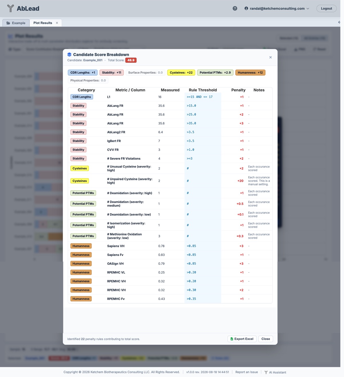
- Candidate name and severity-colored Total Score badge.
- Category subtotal badges styled in solid results colors.
- An itemized table listing every rule triggered: Category (rendered in a results-matched color pill), Metric / Column, Measured Value, Rule Threshold, Penalty Contribution, and Notes.
- A dedicated Export Excel button to download the candidate's itemized rules.
-
Downloadable Excel Exports (
.xlsx):-
Global / Selected Candidates: Click Export Excel in the Plot Results toolbar to download
{ProjectName}_Score_Contribution_Breakdown_{scope}_{timestamp}.xlsx. The generated workbook includes:- Score Summary: Matrix of all candidates with severity-colored total scores, individual category penalty subtotals with category fill headers, and trailing Parent lineage metadata.
- Itemized Penalties: Consolidated table of all triggered rules and liabilities across all active candidates.
-
Single Candidate: Click Export Excel inside the modal footer to download
{ProjectName}_{CandidateName}_Score_Breakdown_{timestamp}.xlsxwith the candidate's title block, category subtotals table, and itemized penalty table. - Exports preserve results category header fills, severity background fills, auto-fit column widths, and use collision-proof timestamps (
%Y-%m-%d_%H-%M-%S).
-
-
Multi-Criteria Sorting: A dedicated Sort dropdown enables ordering candidate bars by:
- Total Score (High to Low) (identifies candidates with the highest overall penalties first)
- Total Score (Low to High) (identifies the most developable leads)
- Candidate Name (A to Z)
- Highest Category Penalties (e.g. Highest Humanness Penalties, Highest Stability Penalties, Highest Potential PTM Penalties, etc.)
Scope & Multi-Selection
- Selected Scope: Focuses strictly on the subset of antibodies checked in the results grid.
- All Entries: Plots the complete project population simultaneously.
- Use the scope toggle pills (
[ Selected (N) | All Entries (Total) ]) at the top right to switch scopes instantly.
Curve Fitting & Trendlines
When in 2D Scatter Plot mode, apply real-time regression models via the Fit dropdown:
- Linear Fit: Calculates least-squares linear regression (\(y = mx + b\)), displaying slope, intercept, and goodness-of-fit (\(R^2\)).
- Polynomial Fit (Degree 2): Solves quadratic curvature (\(y = ax^2 + bx + c\)) using least-squares normal equations, providing non-linear trendlines and \(R^2\).
Best Fits & 1-vs-All Correlation Search
Click the [ ⚡ Best Fits ] button in the toolbar to instantly evaluate and rank all available developability metrics against the currently fixed reference axis (e.g. PB: Viscosity, Score, or AbLang FR):
- Instant Multi-Property Correlation: Evaluates every numerical property in the active candidate dataset (Surface descriptors like
SPNandSPCD, stability scores, predicted biophysicsPB:*, humanness metricsOASign, charges, liability counts, and custom metadata), calculating the exact Pearson correlation coefficient (\(r\)), coefficient of determination (\(R^2\)), trend direction, and valid pair count (\(N\)) in real-time. - Synergy vs. Trade-Off Evaluation: Evaluates the joint polarity between the reference metric and all comparison descriptors. When an inverse correlation exists between a desirable metric (such as OASign Humanness) and a developability liability (such as Deamidation), the relationship is recognized as Synergistic rather than antagonistic, because improving one property simultaneously improves the other. Conversely, positive correlations between humanness and liabilities are classified as acute Trade-Offs.
- Favorable & Antagonistic Sorting: In addition to sorting by absolute correlation (\(|r|\)), positive (\(r > 0\)), inverse (\(r < 0\)), goodness-of-fit (\(R^2\)), and property name, users can sort by Most Synergistic (Favorable) to identify co-optimizable property pairs first, or Most Antagonistic (Trade-Off) to isolate competing developability liabilities.
- Directional & Polarity Badges: Evaluated rows render green
Synergisticor red/amberTrade-Offbadges alongside discrete metric polarity tags (Lower = Better,Higher = Better,Target Range). The modal header displays the reference metric with its active polarity label. - Candidate Feature Inclusion / Exclusion Selector: A dedicated
[ Features: All Included ▾ ]popover lets users include or exclude specific measures or entire property categories (e.g., Predicted Biophysics, Surface Properties, Stability, Humanness, PTMs, or Metadata) from the 1-vs-All correlation search. - Color-Coded Strength Badges: Clearly distinguishes strong positive correlations (\(r \ge +0.50\), dark green), moderate positive correlations (\(r \ge +0.25\), soft green), strong inverse correlations (\(r \le -0.50\), dark red), moderate inverse correlations (\(r \le -0.25\), soft red), and neutral correlations (\(|r| < 0.25\)).
- Bi-Directional Reference: Choose between fixing the X-Axis (to search the best correlating Y metric) or fixing the Y-Axis (to search the best correlating X metric).
- 1-Click Plot Update: Click any metric row or the
[ Plot as Y ]button to instantly assign the metric to the axis, automatically enable the linear regression trendline, and update the scatter plot and diagnostics.
Multi-Variable Predictor & Feature Selection
When experimental metadata (or any developability property) cannot be adequately captured by a single descriptor, switch to the Multi-Variable Predictor (Composite Fit) tab inside the Best Fits modal:
- Ordinary Least Squares (OLS) Regression Engine: Executes real-time multiple linear regression using Gaussian elimination with partial pivoting on the client, systematically evaluating single features, 2-feature pairs, and 3-feature triplet combinations across all candidate descriptors.
- Collinearity & Singularity Protection: Automatically detects near-singular matrices and discards collinear combinations, ensuring numerical stability across complex datasets.
- Candidate Feature Inclusion / Exclusion Selector: A dedicated
[ Features: All Included ▾ ]popover lets users filter in or out specific measures or entire property categories (such as Predicted Biophysics, Surface Properties, Stability, Humanness, PTMs, or Metadata) from the combinatorial search, allowing custom feature subsets. - Adjusted \(R^2\) Ranking: Ranks composite models by Adjusted \(R^2\) (\(R^2_{\text{adj}}\)) to penalize over-parameterization, alongside standard \(R^2\), Root Mean Square Error (RMSE), and sample size (\(N\)).
- Complexity Filtering & Search: Filter models by term count (1 Variable, 2 Variables (Pairs), 3 Variables (Triplets), or All) and search for specific descriptor combinations (e.g.,
SPN + SPCDorAbLang + Charge). - Wide Non-Scrolling Dialog Layout: The Best Fits window expands to a spacious 1200px viewport, accommodating long property names and 3-term equations cleanly without horizontal scrolling.
- Predicted vs. Target Plot Mode: Clicking
[ Plot Model ]maps the fitted multi-term formula \(\hat{Y} = \beta_0 + \sum \beta_j X_j\) on the X-axis (Predicted [Target] (Model)) against the target property \(Y\) on the Y-axis:- Ideal Unity Line: Draws a \(y = x\) dashed diagonal line indicating perfect prediction agreement.
- Active Model Toolbar Banner: Displays the active target, fitted equation, Adjusted \(R^2\), and an
[ ✕ Exit Model View ]button to return to standard 2D scatter plotting. - Interactive Equation Mouseover: Mousing over the fitted equation chip dynamically expands to display the complete, untruncated mathematical formula without ellipsis.
- Candidate Residual Inspection: Hovering or clicking any antibody dot reveals its target property value, model-predicted value, residual error (\(\Delta = Y - \hat{Y}\)), and component descriptor breakdown.
Dimension Reduction (PCA / UMAP)
Select Dimension Reduction (PCA / UMAP) from the Plot Type dropdown to map high-dimensional developability, stability, surface patch, humanness, and biophysical descriptors into an interactive 2D landscape. This enables instant visual identification of candidate clusters, outliers, and developability profiles across antibody screening libraries.
-
Dual Projection Engines:
-
Principal Component Analysis (PCA - Default): Computes a deterministic orthogonal decomposition via Singular Value Decomposition (SVD) on standardized, mean-imputed feature descriptors (\(z = (x - \mu)/\sigma\)). Displays exact individual explained variance percentages for each axis as well as the total 2D explained variance badge (e.g.
PC1: 34.2% • PC2: 18.5% • Total: 52.7%). -
Uniform Manifold Approximation and Projection (UMAP): Applies non-linear manifold learning to uncover non-linear cluster topologies and sequence-function neighborhoods in larger candidate sets (\(N \ge 30\)). Includes customizable local neighborhood size (\(k\), default 15) and minimum manifold distance (\(d\), default 0.10). For small candidate sets (\(N < 4\)), UMAP automatically and gracefully falls back to PCA with an informative toolbar badge notice.
-
-
Publication-Style Biplot Feature Loading Vectors:
-
When in PCA mode, toggle
[ Loadings: ON / OFF ]in the toolbar to render vector arrows radiating from the coordinate origin \((0, 0)\). -
Arrow vectors show the direction and strength with which specific developability descriptors pull candidate positions across the 2D space.
-
Vectors are scaled proportionally to 75% of the data extent and labeled with high-contrast pills.
-
Hovering over any vector highlights its exact PC loadings and descriptor name.
-
-
Feature Category Inclusion / Exclusion Popover:
-
Click
[ Features: All Included ▾ ]to open the multi-category feature filter. -
Quickly include or exclude entire property categories (Predicted Biophysics, Stability, Surface Properties, Humanness, Physical Properties, Potential PTMs, Metadata) or search and toggle specific metrics with 1-click All and None shortcuts.
-
-
Dimension Switching & Interactive 3D PCA:
-
A dedicated dimensions selector allows switching between PC1 vs PC2, PC1 vs PC3, PC2 vs PC3, and 3D (PC1 × PC2 × PC3) to explore orthogonal variance axes.
-
In 3D PCA mode, the chart seamlessly transitions to a hardware-accelerated WebGL Three.js canvas featuring full 3D orbital navigation (left-click drag to rotate, right-click drag to pan, scroll to zoom).
-
Reset 3D Button: Clicking
[ Reset 3D ]instantly restores the default isometric camera perspective. -
3D Feature Loading Vectors: Biplot loading vectors render as 3D arrows originating from the center \((0, 0, 0)\) with camera-facing text badge sprites indicating descriptor influence across all three dimensions simultaneously.
-
Interactive 3D Raycasting: Hovering over any 3D candidate sphere highlights the data point, and clicking opens the candidate inspection drawer and sticky tooltip.
-
-
Interactive Candidate Inspection & Tooltips:
-
Hovering or clicking any candidate dot displays its exact projection coordinates (\(PC1/PC2\) or \(PC1/PC2/PC3\) or \(UMAP1/UMAP2\)) and the top contributing descriptors driving its placement.
-
Selecting a candidate opens the bottom drawer showing its full lineage, germlines, and developability profile.
-
-
Comprehensive Feature Loadings Modal:
-
Click
[ ▦ Table ]in the toolbar to open the full feature loadings dialog. -
Inspect all feature loadings with individual PC1, PC2, and (in 3D mode) PC3 loadings, plus combined vector magnitudes and primary directional influence.
-
Filter features by search keyword, sort by highest magnitude, positive/negative PC contributions, or property name.
-
-
Downloadable Excel Export (
.xlsx/.csv):-
Click Export Excel in the toolbar to download a complete
{ProjectName}_Dimension_Reduction_{Method}_{timestamp}.csvexport. -
Includes candidate projection coordinates (\(PC1, PC2\), and \(PC3\) when in 3D mode), parent lineage, germlines, and full principal component feature loadings.
-
-
Integrated Visualization Controls:
- Dimension reduction seamlessly integrates with categorical Group By coloring (parent clone, germlines, score tiers), Size radius scaling, name Labels, and the Find search highlighter across both 2D and 3D modes.
Zones & Shading (Quadrants & Quartiles)
Apply background zone tinting and crosshair partitions via the Zones dropdown:
-
Polarity-Aware Median Quadrants (4-Zone): Divides the 2D scatter space along median X and median Y into four distinct quadrants with live candidate counts and percentages per quadrant. Rather than assuming the top-right quadrant is always favorable, the engine evaluates the polarity of both axes:
- Optimal (Soft Green): Shaded in the quadrant representing the favorable intersection of both metrics (e.g. Bottom-Left when plotting two penalty or liability metrics; Top-Left when comparing low liabilities on X against high humanness on Y; Top-Right when plotting two metrics where higher is better).
- Risk (Soft Red): Shaded in the quadrant representing the unfavorable intersection where both metrics violate desirable thresholds.
- Trade-Off (Soft Amber / Blue): Marks mixed quadrants where one metric is favorable while the other is compromised.
-
Polarity-Aware Y-Axis Quartiles (25% Bands): Overlays four horizontal 25% percentile bands based on the Y-axis metric. When lower values are desirable (e.g. liabilities, viscosity, KBC Score), the top 25% performers (values below \(Q_1\)) are shaded green as
Top 25% (Best: < ...), while the bottom 25% (values above \(Q_3\)) are shaded red asBottom 25% (Risk: ≥ ...). - Polarity-Aware X-Axis Quartiles (25% Bands): Overlays four vertical 25% percentile bands across scatter plots or single-metric distribution histograms, inverting color shading to highlight the favorable quartile in green when lower values are optimal.
Categorical Grouping & Bubble Sizing
- Group By: Color-code data points by Parent Clone, Heavy Germline, Light Germline, Species, or Score Tier (dynamically calibrated project terciles).
- Size (Z-Axis): Scale point radii (5px to 16px) by any selected developability metric or leave as Uniform.
Search & Highlighting
- Use the Find input to type a candidate or clone name. Matching points are immediately highlighted with an amber marker and bold name label while non-matching data points and labels are dimmed, allowing rapid visual isolation in dense candidate clouds with zero animation lag.
Diagnostics & Export
The statistics bar below the chart continuously calculates:
- Sample Count (\(N\)): Total active data points plotted.
- Pearson Correlation (\(r\)): Linear correlation coefficient with color-coded positive/negative badges.
- Regression Fit: Active fit formula and coefficient of determination (\(R^2\)).
- Ranges & Averages: Minimum, maximum, and average values across X and Y axes.
PNG & Batch Plot Export
The PNG button in the toolbar functions as a dropdown menu with two export modes:
- Export Current Plot (PNG): Instantly downloads a publication-quality, high-resolution PNG image of the active chart (including visible point labels, regression trendlines, custom group coloring, and polarity-aware quadrant shading) with a clean, opaque white background.
-
Batch Export Plots (ZIP)...: Launches the Batch Plot Export generator to produce and package complete sets of scatter plots across all or selected candidate properties:
- Fixed Axis Selection: Choose to Hold X Constant (Vary Y) or Hold Y Constant (Vary X), selecting any reference metric as the anchor.
- Categorized Metrics Checklist: Select comparison metrics across all project categories (Developability, Liabilities, Humanness, Biophysical, CDR Lengths, Metadata) with real-time selection counts, search filtering, and category-level select/deselect toggles.
- Visual Option Preservation: Optionally preserve active trendlines (linear/polynomial), median quadrants or quartile bands, group coloring palettes, and candidate point labels across all generated figures.
- Candidate Scoping: Generate plots for the entire candidate population or restrict to the currently selected candidate subset.
- Output Resolution: Choose between Standard (1200 × 750, 1x) or High-Resolution (2400 × 1500, 2x) for publication-grade presentations.
- In-Browser Offscreen Generation: Plots are rendered rapidly in the browser using an offscreen canvas and bundled with JSZip, displaying a real-time progress bar and automatically downloading
{ProjectName}_Batch_Plots_{FixedMetric}_{YYYYMMDD}.zipwith zero backend server overhead.